Daylight brand guide
Daylight
Darkroom turned inside out. White paper, black ink, the same black-and-white photography.
Register: Fibre print
Identity
Daylight is Darkroom with the lights on. Everything is kept: the film-title hero, the plate-framed prints, the contact sheet, the slow page, the serif. Only the paper changes.
The palette is a fibre-based print viewed in a bright room: white paper, a deep navy ink, and one cool mid-tone for anything that should sit back. The only hue on the page is the ink itself.
Where Darkroom asks the photograph to warm a black room, Daylight lets the white room recede so the photograph is the darkest thing on the page. The eye goes straight to it.
Logotype

Construction
- Line one in Cormorant Garamond Light (300), tracking -0.01em.
- Line two in Figtree Regular (400), uppercase, tracking 0.32em, in Ink, at 0.26x of line one.
- Centered lockup. Line two sits 0.7x below the baseline of line one.
- Ink on white only. On photography, over a soft white scrim.
Clear space
- Clear space equals the x-height of line one on all sides.
Misuse
- Never set on a dark background.
- Never italicize line one in the logotype.
- Never introduce a second color. Line two is Ink, not the mid-tone.
Color
Paper white
Primary background
#FBFBFC
Fixer
Secondary surface, form fields
#F0F1F5
Ink
Primary type, frames, the call to action
#03043D
Ink, lifted
Hover state of the filled button, focus rings
#0B1942
Mid-tone
Secondary type, captions
#4F5478
Hairline
Rules and dividers
#D6D8E2
Rules
- One hue is the rule. Ink is a deep navy, and every neutral is tinted toward it so nothing reads as a leftover grey.
- Ink is both the type color and the accent. The primary button is its only filled use; everywhere else it is a line. On hover the button lifts to the brighter navy, never to a new color.
- Photography is greyscale at the identity level, so any source image becomes correct on the page.
Typography
Display
Cormorant Garamond
Kept from Chiaroscuro and Darkroom so the three read as one family. Its italic is the only emphasis inside a headline.
Body
Figtree
Legible in black on white at small sizes and quiet enough to disappear behind the serif.
Display
Light, and what it reveals.
300 / 72 / 104px
-0.01em tracking, 0.98 leadingHeading
The surgeon
400 / 44px
0 tracking, 1.05 leadingLead
Printed once, by hand, and kept.
400 / 26px
0 tracking, 1.35 leadingBody
Consultations are available after hours, by appointment, through a private entrance.
400 / 16px
0 tracking, 1.65 leadingLabel
PLASTIC SURGERY
400 / 11px
0.32em tracking, 1 leading
Rules
- Serif only at 26px and above. Below that, Figtree.
- Italic is for a single word or phrase in a headline, never a whole line.
- Ink at 100 percent for headings, Mid-tone for anything secondary.
Photography

Light
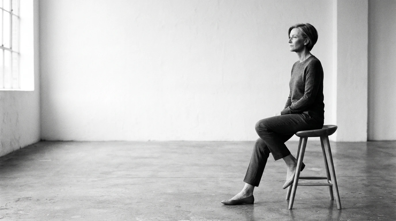
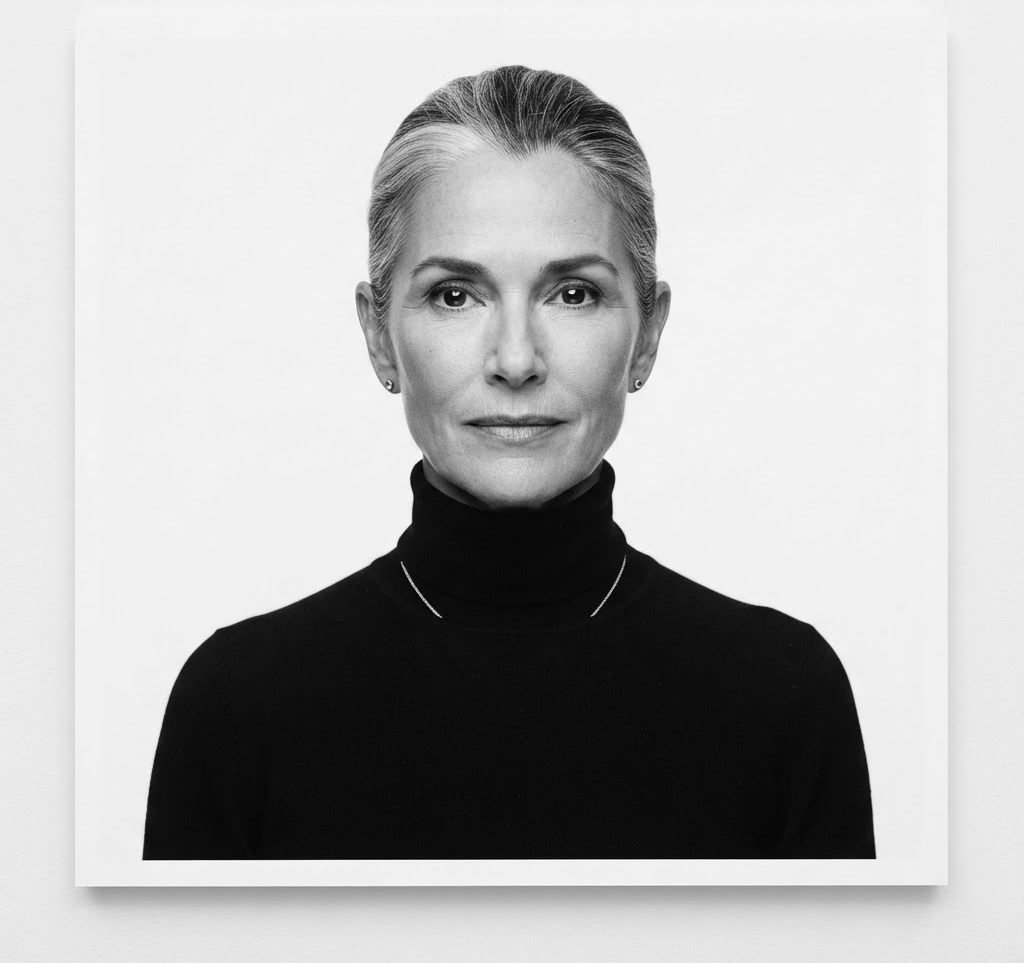
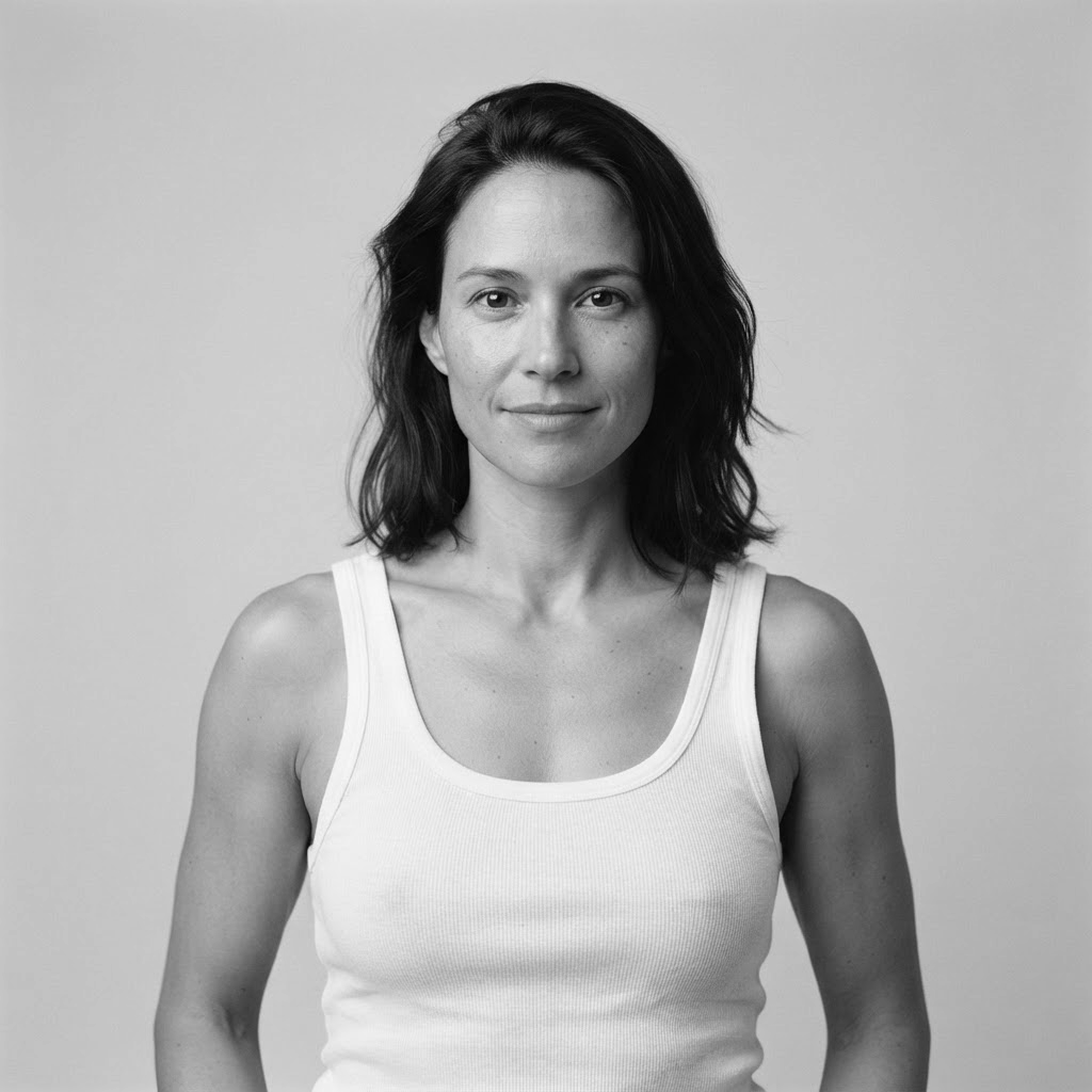
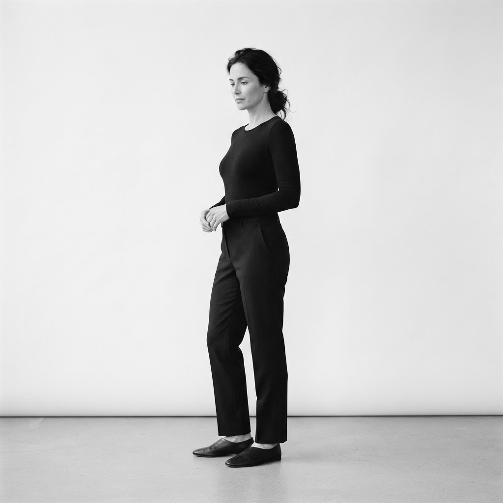
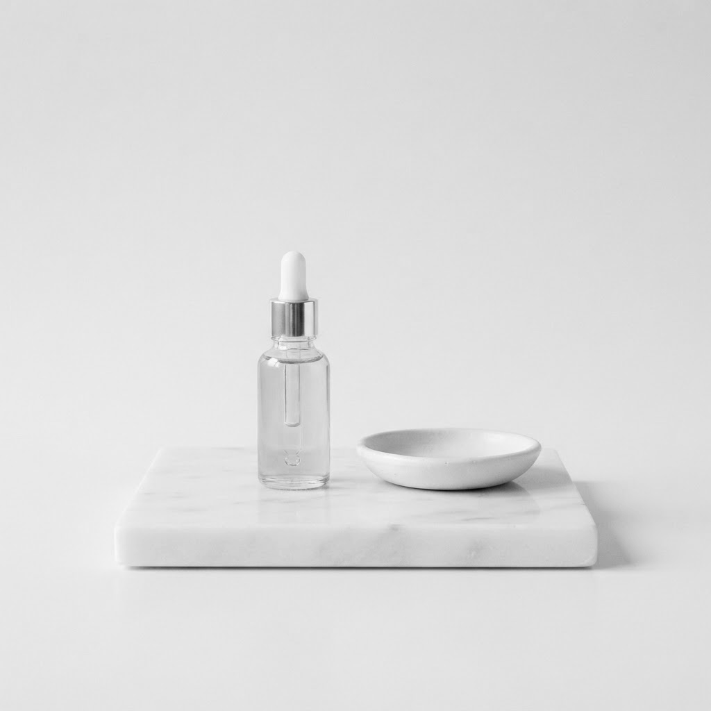
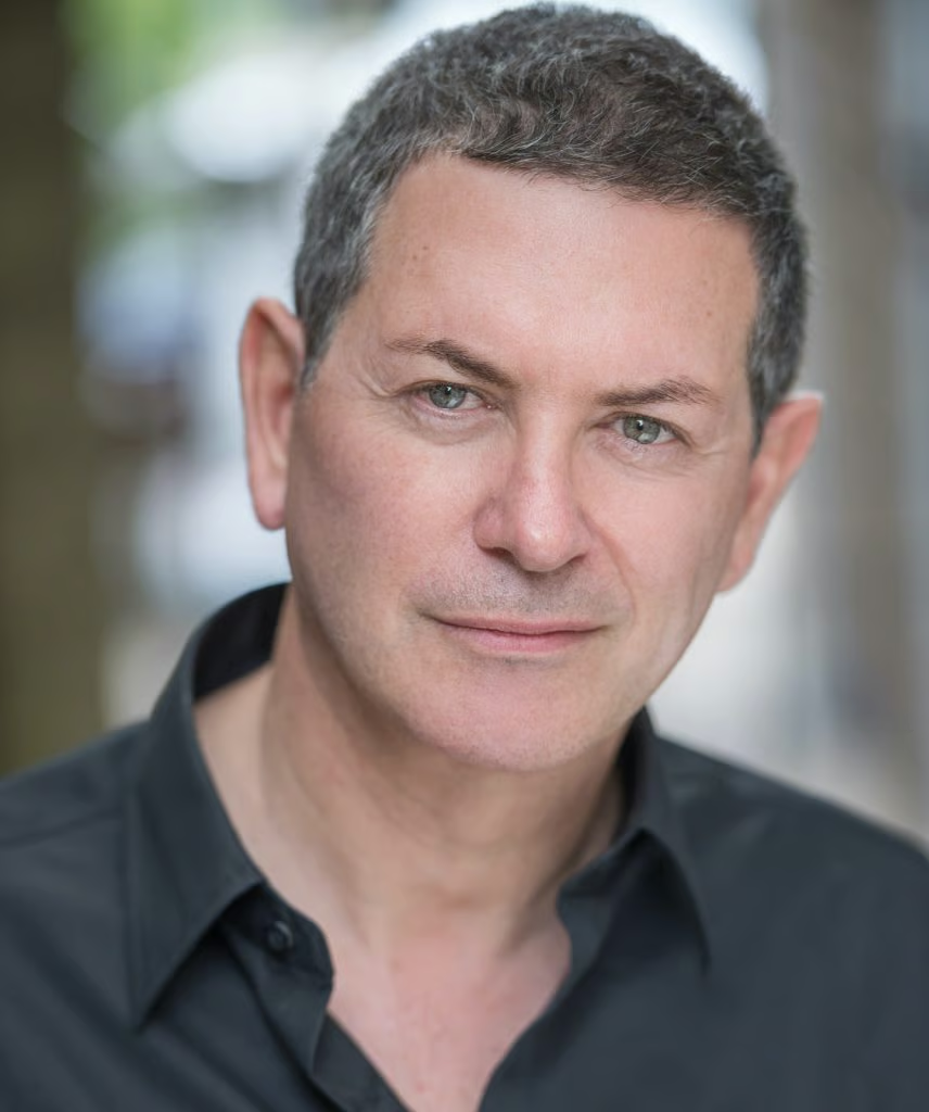
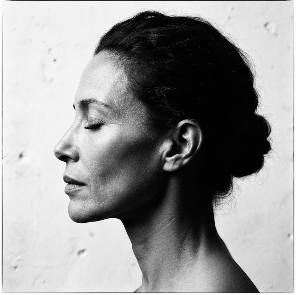
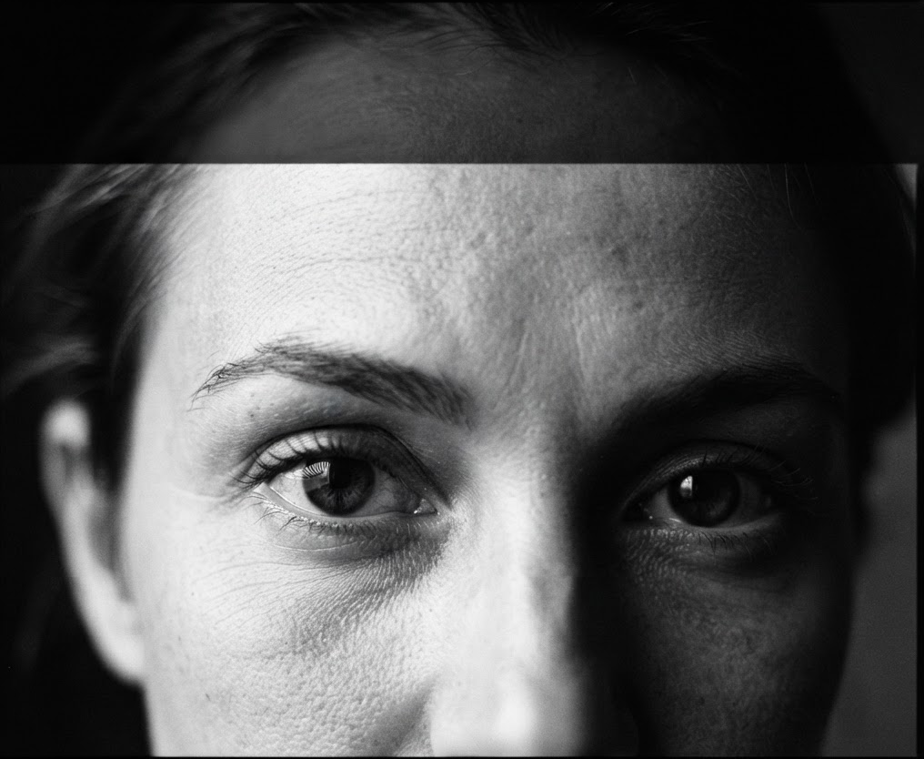
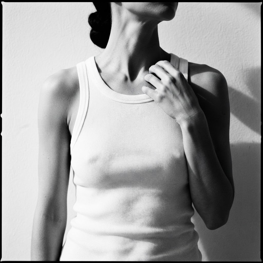
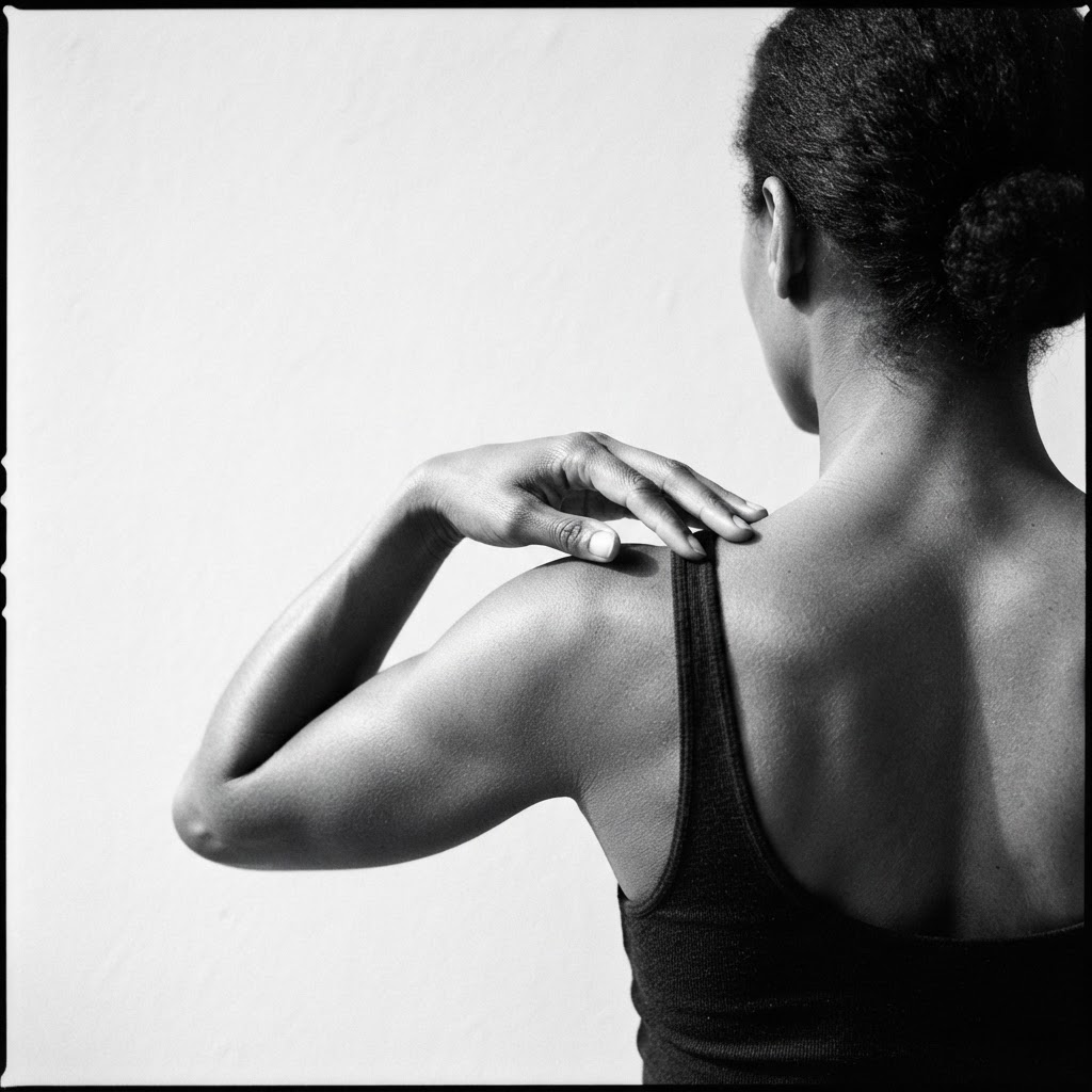
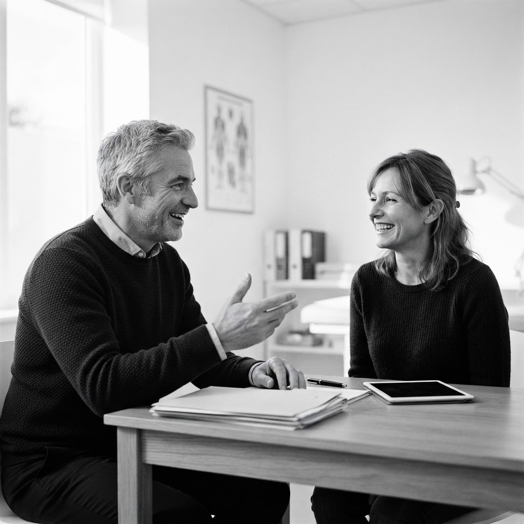
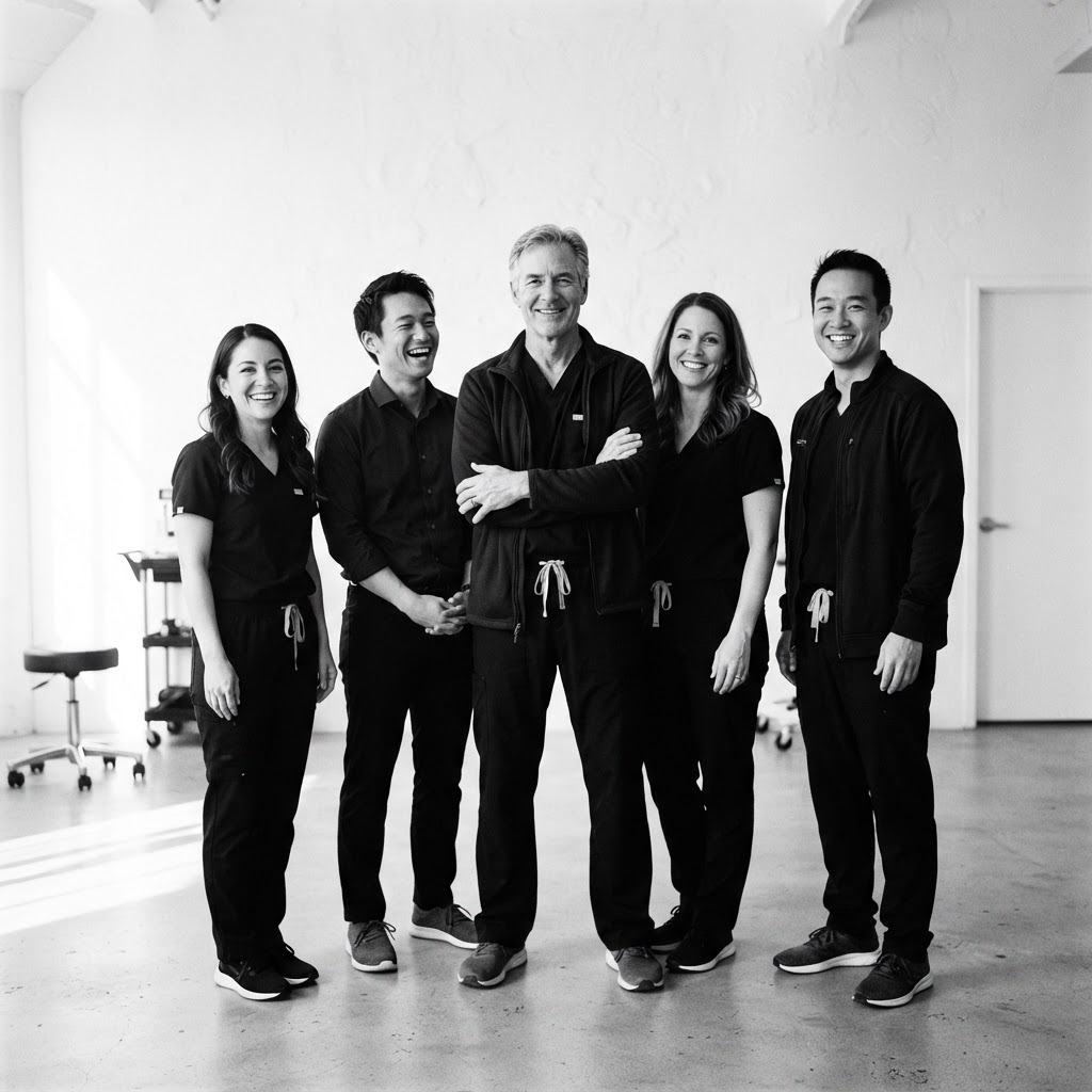
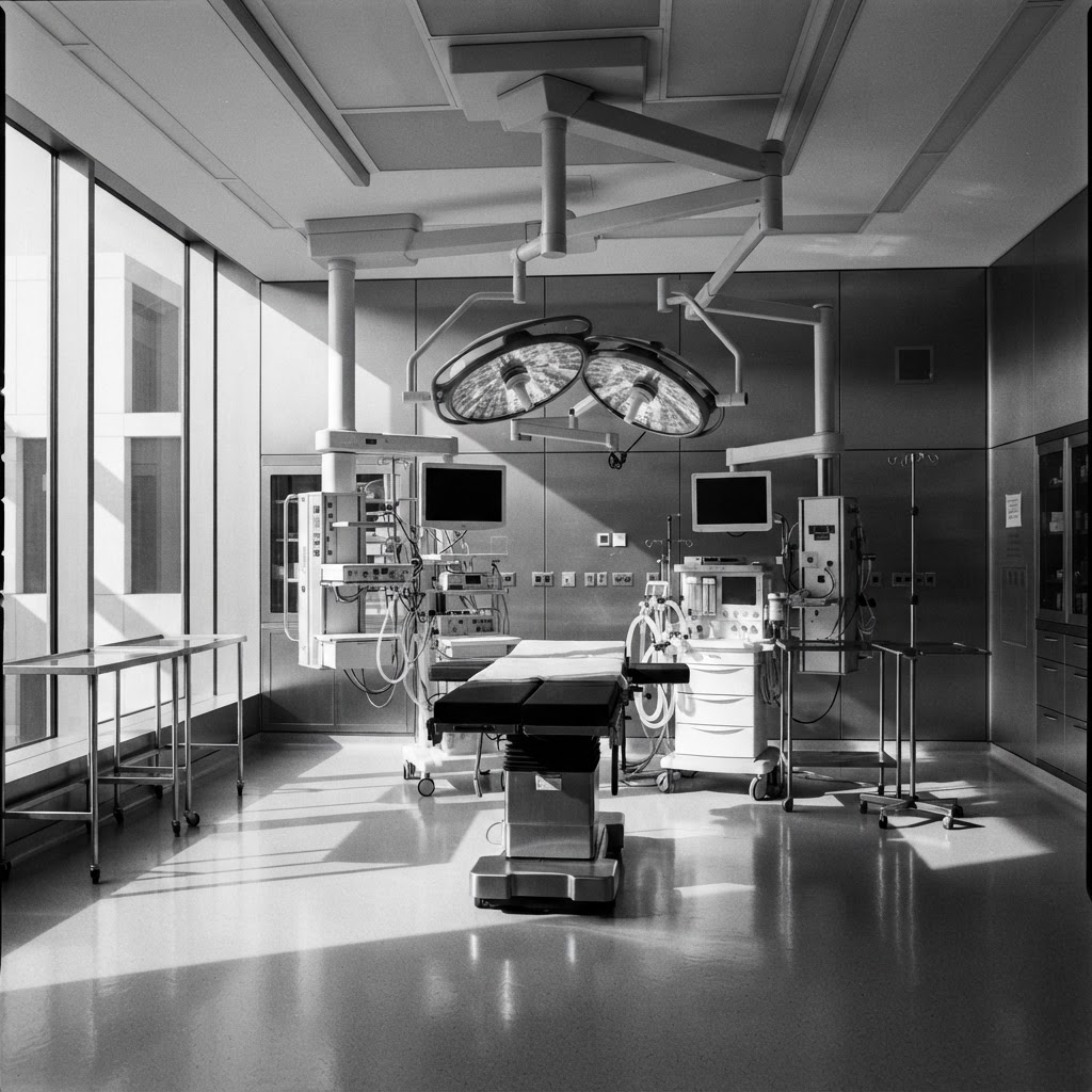
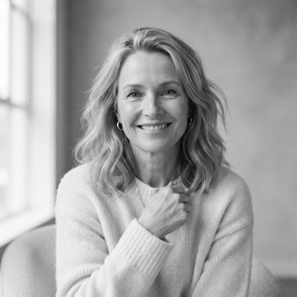
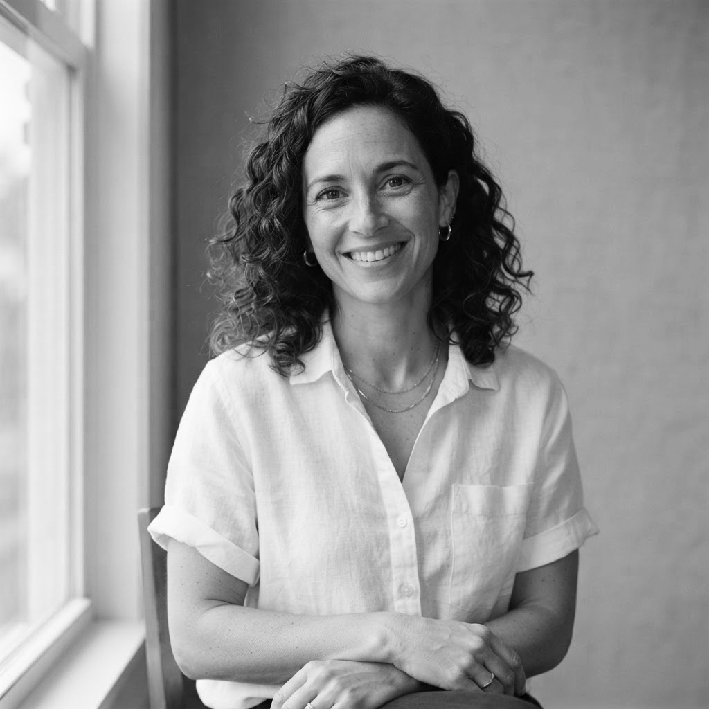
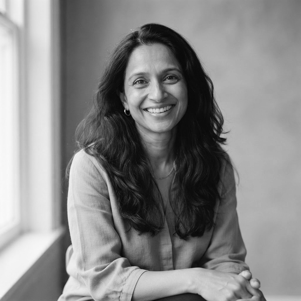
Single-source window light or one soft lamp. Deep shadows that hold detail. Highlights clean.
Subject
A subject half in light, half in shadow. Stone, linen, a single steel instrument catching one highlight. Empty rooms at dusk.
Crop
Tall 4:5 and 3:4 for portraits and procedures. Wide 16:9 for the surgeon. Subjects placed off-center toward the light.
Color
None. Every image is greyscale. Full tonal range from ink to paper; no crushed shadows.
Avoid
- Any tint or toning
- Flash
- Smiling at camera
- Anything clinical-bright
Layout
- Identical to Darkroom and Chiaroscuro. Photography bleeds off the right edge; type holds the left.
- Every photograph sits inside a flush 2px Ink plate, like a print pinned to a white wall.
- Section spacing 160 to 224px at desktop. The page is allowed to feel slow.
- No radius anywhere. Corners are square, as prints are.
Motion
The page moves the way a print comes up in the developer tray.
The signature
The plate-framed print as the procedure index. Hovering a procedure swaps the large photograph; the Ink plate settles a beat after the image.
Budget
- Frame settle: fade over 0.9s, ease-out, once.
- Headlines fade up once on first view.
- No parallax, no scale, no hover motion beyond an Ink underline.
- All motion removed under prefers-reduced-motion.
Voice
Composed, discreet, a little literary. Longer sentences are allowed if they earn it.
Principles
- Speak to one person, in confidence.
- Understatement over assurance. Never use the word luxury.
- Acknowledge privacy directly; it is the reason this identity exists.
Write this
Light, and what it reveals.
Not this
Transform your look with stunning, natural results.
Write this
Consultations after hours, through a private entrance.
Not this
VIP concierge experience available.
Write this
Request a private consultation
Not this
Book now
Do and don’t
Do
- Frame every photograph. Consistency of the plate is the identity.
- Let the serif do the talking at large sizes, then get out of the way.
- Keep the page white from top to bottom. No dark sections.
Don’t
- No color. Not in type, not in photography, not in a single icon.
- No glow, no blur, no gradient.
- No second serif, ever.